UM uses three fonts internally: Thesis Sans (from the Dutch type setter Lucas de Groot) for all printed material and for the UM website, Verdana for all other digital products and letters and Calibri for PowerPoint presentations. For more information please scroll to the bottom of this page.

UM Typography Thesis 1

Various Thesis typefaces are available; UM uses (sans-serif) Thesis Sans, which comes in many fonts (bold, regular, light, etc.). Thesis Sans is the standard typeface used in UM’s basic house style elements, such as the logo, endorsed A-brands and UM unit names . We recommend using Thesis Sans as often as possible; along with the logo and colours, typography reflects the same standards of consistency for all university units.

UM Typography Thesis 2

Professional users – including our preferred suppliers, such as (DTP) designers with graphic design programs – use a open type (CFF) version of Thesis Sans. UM’s corresponding licence covers the following Thesis Sans font styles.

  • Thesis Sans Bold
  • Thesis Sans Semi Bold
  • Thesis Sans Regular
  • Thesis Sans Semi Light
  • Thesis Sans Expert
  • Thesis Sans Bold Italic
  • Thesis Sans Semi Bold Italic
  • Thesis Sans Regular Italic
  • Thesis Sans Semi Light Italic

It is recommended to always balance the weight of different fonts used (for example to combine Thesis Sans Bold with Thesis Sans Regular or Thesis Sans Semi Bold with Thesis Sans Semi Light). For design and layout, please contact our preferred suppliers. For the website only the font weights Semi Light, Plain, Bold and tabular lining figures should be used.

Use the Truetype typeface ‘Verdana’ for stationery, reports and other digital communication media. The typeface "Calibri" is used for Power Point presentations. Verdana and Calibri are standard Microsoft Windows inclusion available on all PCs.

um typografie

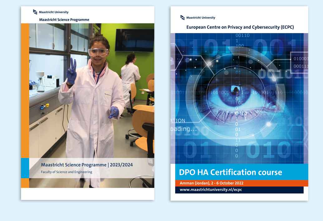
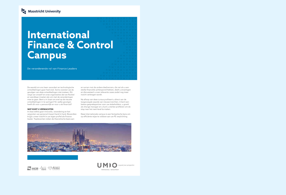
The layout of all UM communications (e.g., brochures and advertisements) consists of several style characteristics, such as the white band, logo and free space. Together, they are used in a basic grid that may differ for each communication medium. Templates are available for grids used regularly.

Check whether a template is available via "Printed and digital media". No templates are created for one-off-often unique media. You can contact one of the preferred suppliers, who are aware of all current corporate identity guidelines. The House Style Office can give advice if necessary.
Standard media such as posters and flyers can be made up via the templates in the publishing platform.

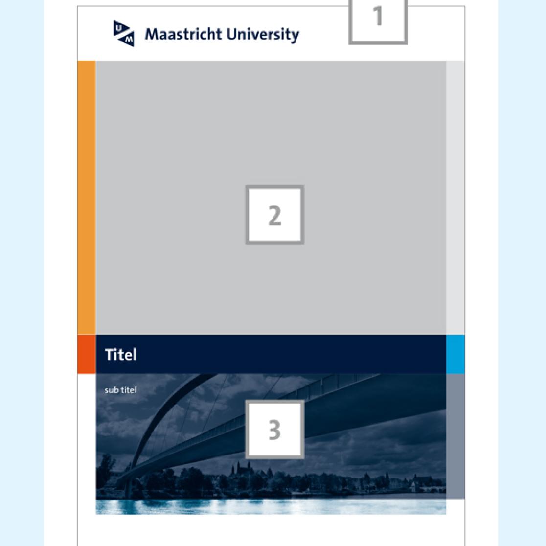
Grids and style characteristics sections:

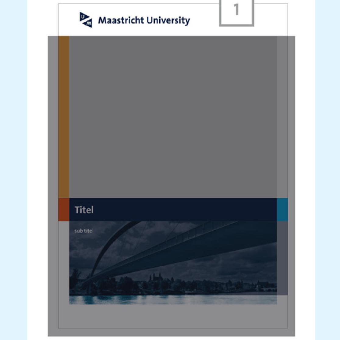
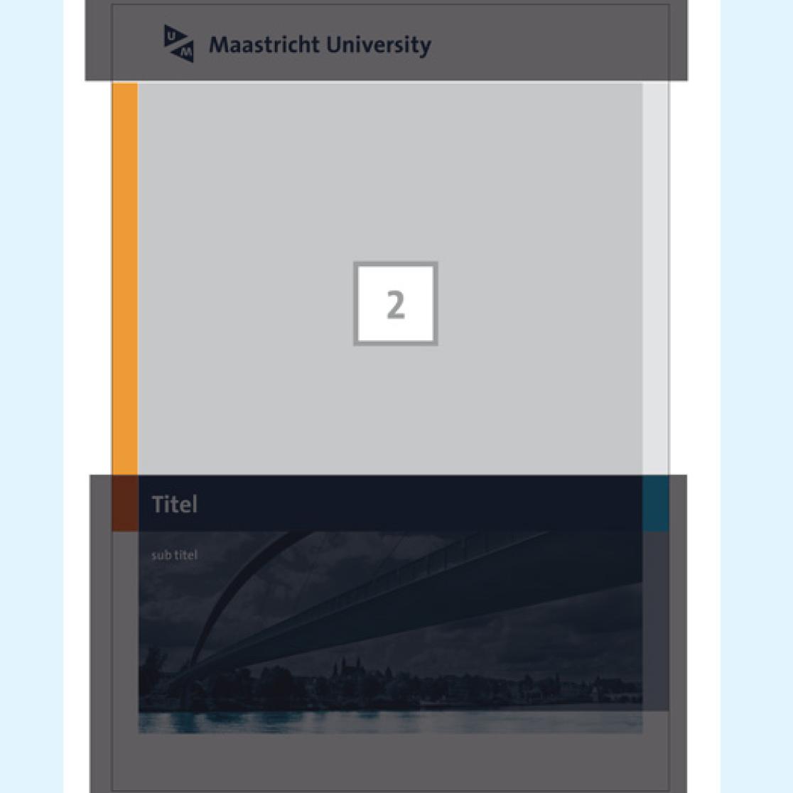
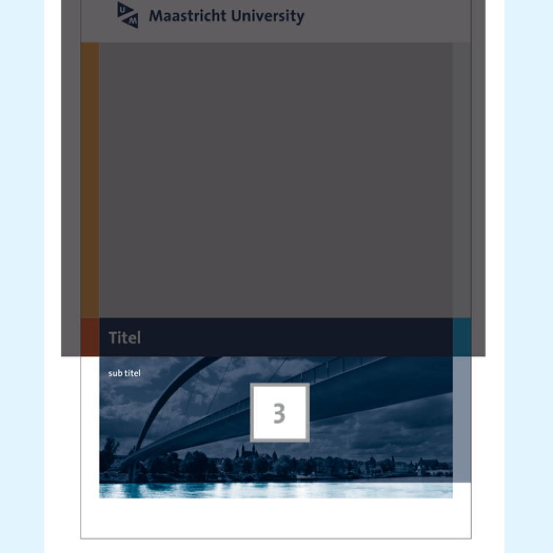
  1. White Band (+ logo)
  2. Free space (Photos & illustrations)
  3. Image brand

----------

Grid and style main

Grid Make-up

You can draw both vertical and horizontal construction lines every 5mm.

  • step 1: Determine which quadrant applies. Place the white band, including logo. See Logo location and white band height.
  • step 2: Check that the white band height at the bottom does not exceed that of the upper white band.
  • step 3: Determine the vertical edges of the free space.


The edges are usually 5mm or 10mm wide. The white parts on the left and right may not be wider than 1/2 of the white band and can be used for a:

  • white band
  • transparent white band
  • UM-colour transparent band
  • different UM-colour band
  • combination of the above


----------

Transparency

The UM house style works with transparent white or UM-coloured spaces over other coloured spaces and parts of photos or illustrations (especially in the free space’s vertical bands).

home style transparancy

White band

Grid and style white space and hook

Logo location and white band height

To place the logo, start from the fixed white space; this white space built in the eps. must always be maintained. The height of the white band is preferably a multiple of 5mm and may differ for each application.

logo plaatsing

Free space

The free space consists of that left after placing the white band at the top and (optional) white band at the bottom. This is where you can include photos and text.

In the free space you can:

  • only use UM colours in the prescribed proportions/values
  • use these colours in percentages
  • arrange the layout using horizontal and vertical construction lines at 5mm intervals

The free space may include the following elements:

  • image band
  • title and text band
  • illustration or photo band

The band heights are variable and can always be divided by 5mm.

Grid and style free space

----------

Photos and illustrations

You can put photos and/or illustrations in the free space. To do so, you can use the UM 'image bank' if you wish.

When including images, please note the following:

  • try to choose photos and/or illustrations that harmonise with the house style colours
  • also, make sure that the photo or illustration is large enough (100% 300 dpi)
  • remember to supply the photo or illustration in rgb format

Please consult the list of preferred suppliers for photographers informed of the UM guidelines.

Image brand

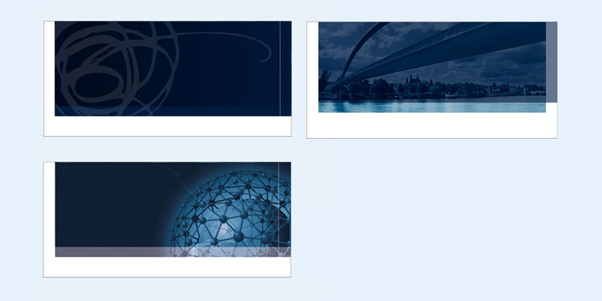
For corporate media (quadrant 1) there are several options:
• image band with a photo (see example with bridge over the Maas)
• image band with a colored surface without a photograph
• no use of the image band

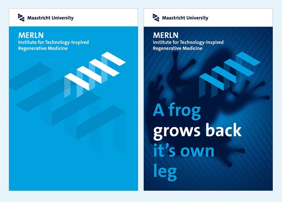
Organisational units that fall under quadrant 2 (endorsed-identity A-brands) are allowed to use their own image band; see the examples below. For more information on designing your own band please contact the House Style Office. You can also include text in the image band.

Grid and style image brand
Image band

Quadrant 1: UM identity

Quadrant 1 applies to most of the university, including all faculties, various service centres and the Maastricht University Office.

Quadrant 1: UM Identity

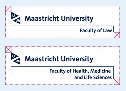
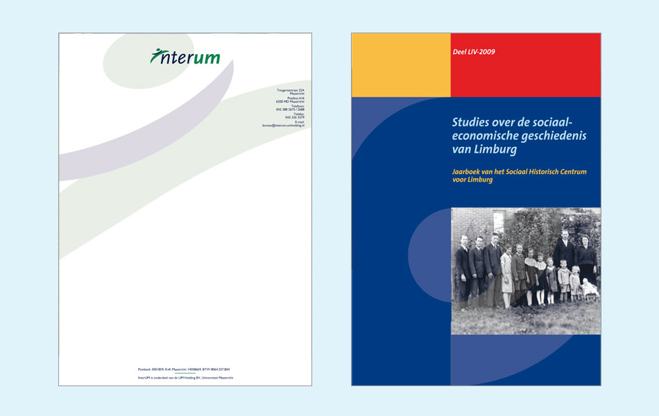
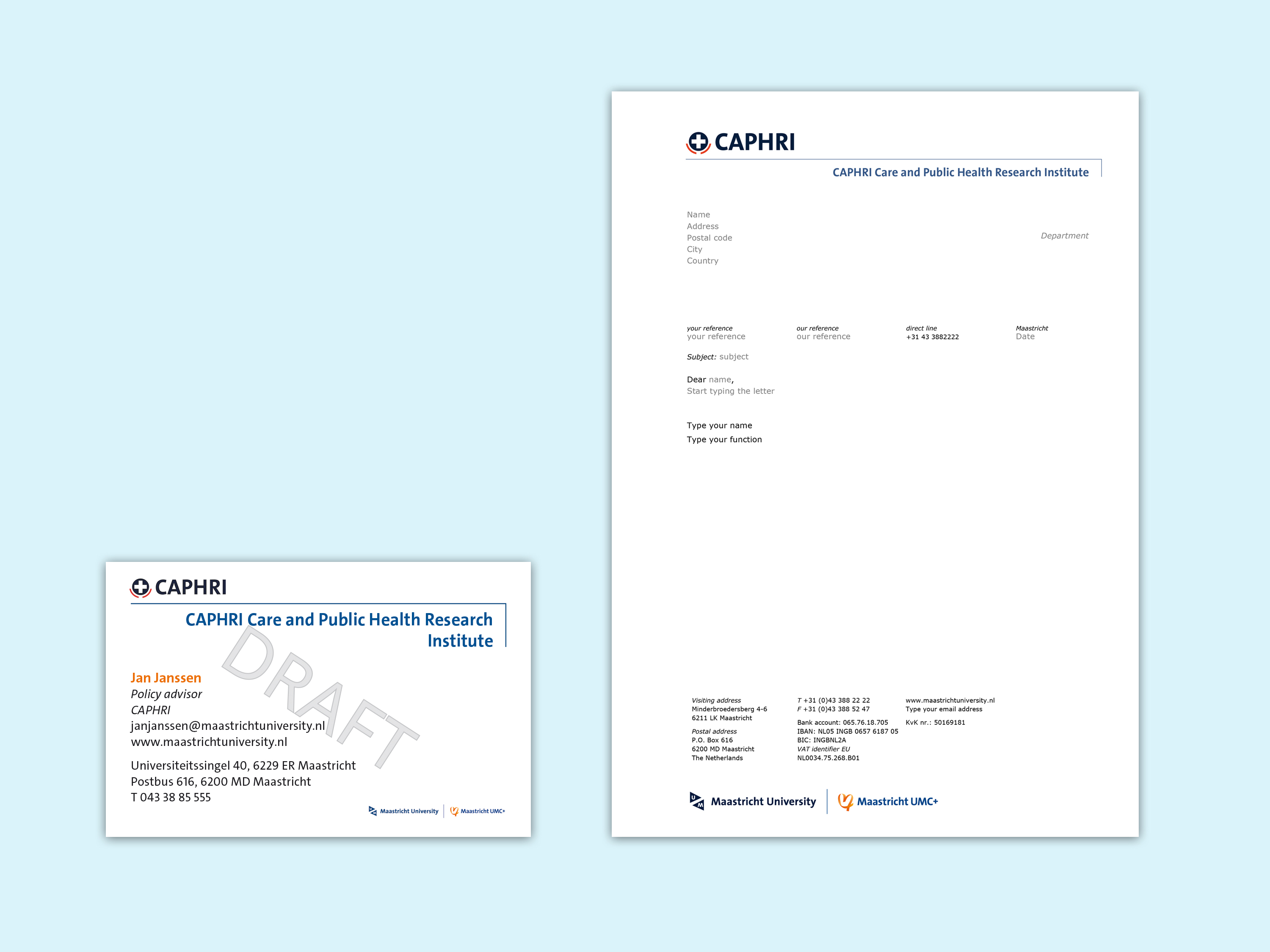
On media such as letterheads and business cards, the logo (brand layer 1) is used together with the unit’s name (brand layer 2) in a fixed construction. Both brand layers are in Thesis Sans Bold and mutually linked by a hook. The letterhead and business card examples below show that various proportions are possible depending on format. The differences are mainly in height, because the word brand – depending on the name length and format width – covers one or more lines. The business card has the most compact version on the smallest format.

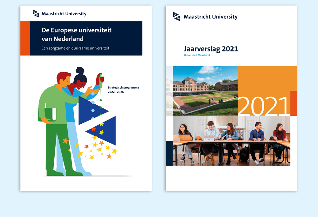
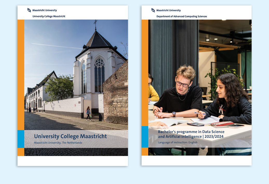
In other media, such as brochures, advertisements, posters, etc., the unit name can be placed in the free spaces in the grids/templates. See the examples below, where the unit name is included in the title bar.

Compact version

The smallest and most compact version of the UM logo is that used on the UM business cards. When the logo is combined with the name of the organisational unit, they must be connected with a hook as shown in the example below. The hook's length can vary depending on the name length. The only other use for this compact version is by external parties (e.g. as a sponsor logo on posters).

The compact logo may not be reversed (white on a dark background); it must always be placed on a white background. A fixed white space has been reserved around the brand for this (see the example below).

Quadrant 1 compact version

Quadrant 2: Endorsed identity

Quadrant 2 applies to A-brand university units allocated as such by the Executive Board (EB) and deans.

Quadrant 2: UM logo combined with A-brand

Inter-faculty A-brands

The existing quadrant-model doesn't provide direction for the recent developments around Kennis-As/Brightlands, the campuses, Triple-Helix (a partnership between universities, business and government to further develop the region) and the emergence of new inter-faculty institutes. Therefore a new variant has been developed.

Interfaculty A-brand

Compact version

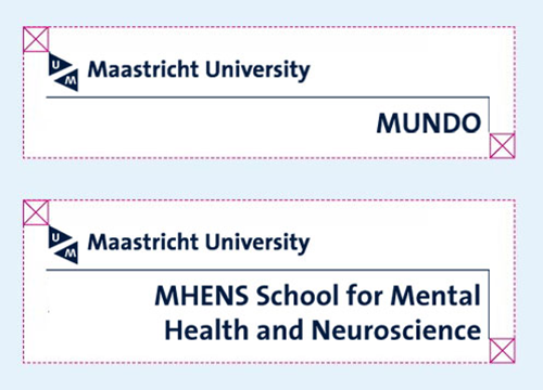
The smallest and most compact version of an endorsed A-brand is that used on the UM business cards. When the UM logo is combined with the name of an A-brand, they must be connected with a hook as shown in the example below. The hook's length can vary depending on the name length. The only other use for this compact version is by external parties (e.g. as a sponsor logo on posters).


Quadrant 2 compact version endorse a-merk

UM logo / endorsed brand construction

In a layout, the endorsed brand is always placed at the bottom left of the UM logo at a fixed distance from it. Depending on its length, the endorsed brand’s name covers one or two lines. The "M" of the logo aligns with the first letter of the name of the A-brand.

UM Logo endorsed brand construction

A-formats (portrait or landscape) and other formats

Check whether you can download a template via Print and digital media. If not, please contact one of the preferred suppliers.

Quadrant 3: Dual Identity

Some UM units collaborate with other organisations. The house style seeks to offer a tool for shaping this collaboration. How this dual identity can be visualised in house style will be fine tuned together with the relevant organisations on a case-by-case basis.

Quadrant 3 Dual Identity

Quadrant 4: Independent brand

UM Holding (co-)owns a limited number of market-oriented companies which can present themselves as independent brands. With these companies, UM may present itself by way of a compact text placed on communications. For example, Etil is a 100% daughter company of UM Holding.

Quadrant 4: Independent brand

Globalisation & Law Network seminar with Domenico Carolei

On 12 June 2024, Dr Domenico Carolei, Lecturer in Public International Law and Public Law at the University of Stirling, gave a talk enti

domenico

The name Maastricht UMC+ (MUMC+) stands for the collaboration between the academic hospital Maastricht (azM) and the Faculty of Health, Medicine and Life Sciences (FHML) of Maastricht University (UM). Together, they form the eighth university medical centre in the Netherlands under the name MUMC+.

UM first

If UM is the dominant party in the collaboration, the UM logo will be included first and the UM house style guidelines will apply.

MUMC+ first

If MUMC+ is the dominant party in the collaboration, the MUMC+ logo is included first and the house style guidelines of MUMC+ apply.

For questions about the guidelines and applications of the MUMC+ house style, you can contact the Marketing and Communication department of FHML or the Communications Office of MUMC+.

UM only (FHML education)

For students and prospective students, only the UM logo and the UM house style are used.

MUMC+ only (patient care)

In the hospital, only the MUMC+ logo and house style are used.

Quadrant 1: UM-MUMC+

The UM-MUMC+ logo combination is used in the following cases:

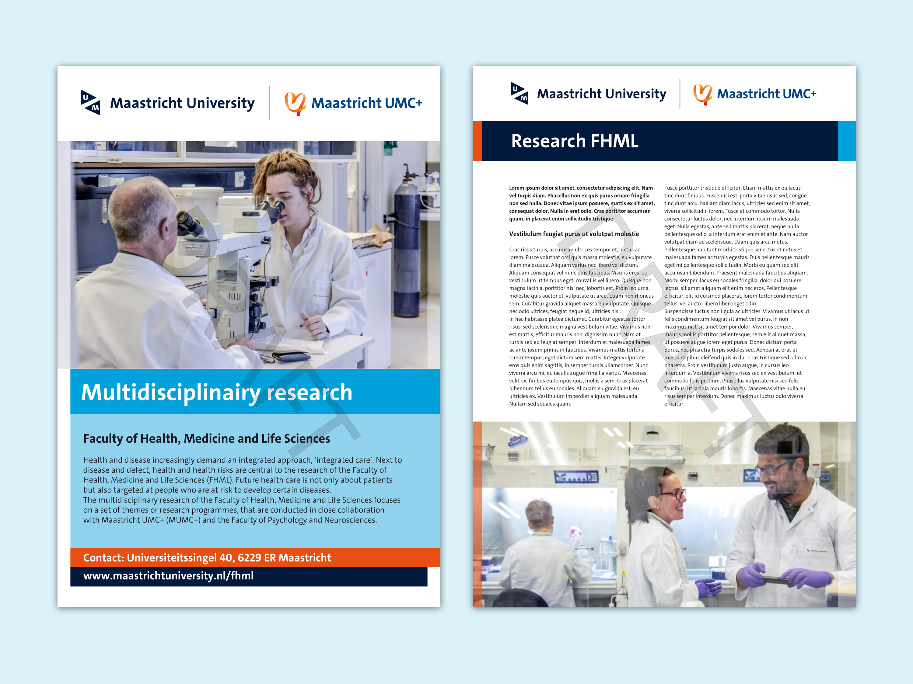
  • for all materials related to FHML research
  • FHML general materials (letterhead, business cards, badges)

Examples:

Quadrant 1 templates

The following templates are available through the communication guide and/or through the publishing platform.

*  These templates are only available through the publishing platform.
** These templates are available through both this communication guide and through the Library of the publishing platform.

Quadrant 2: research institutions FHML + UM-MUMC+ (endorsed identity)

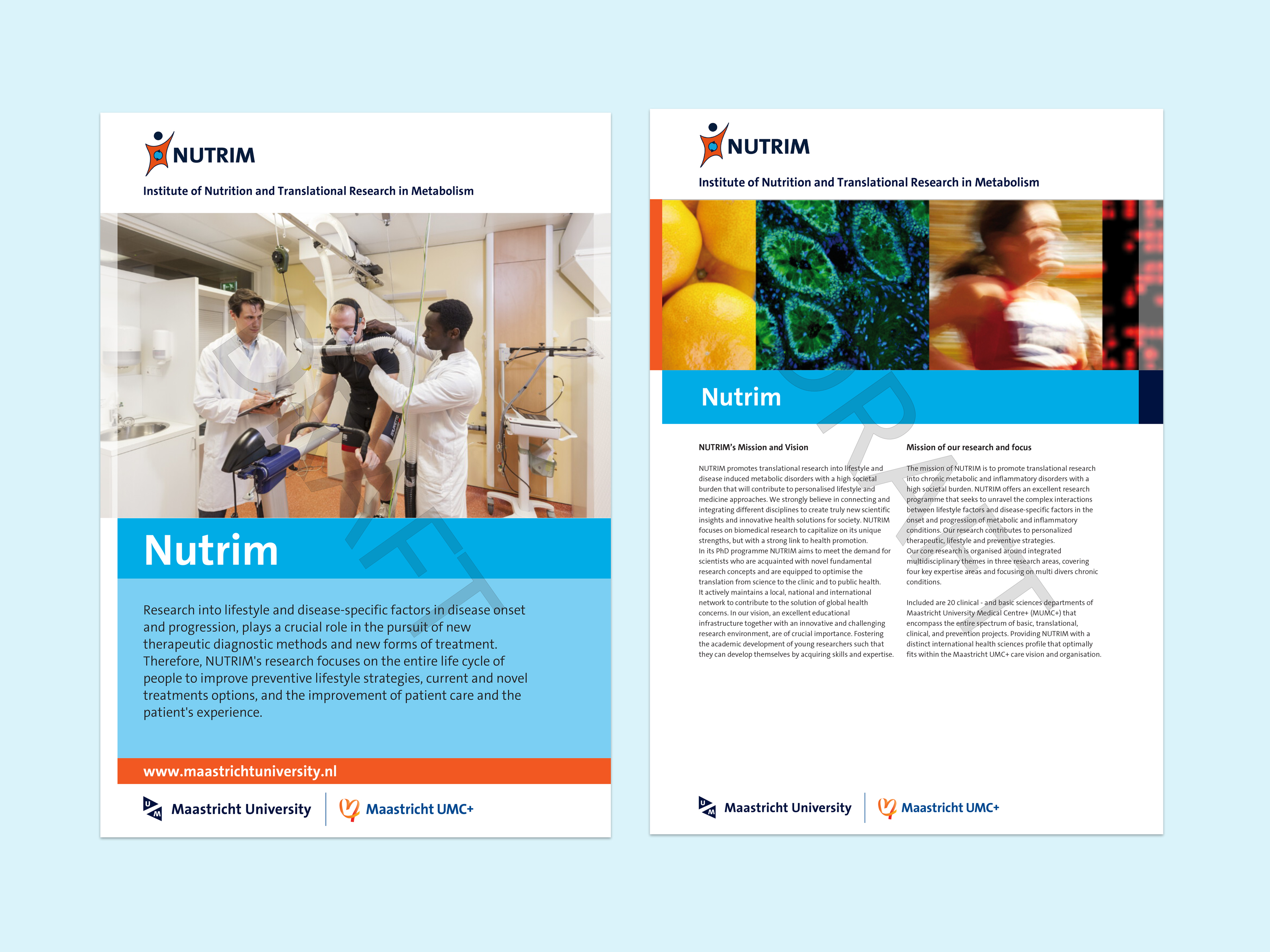
The following institutes/schools use their own logo, but it should always be supplemented with the UM-MUMC+ logo combination (which is called an endorsed logo): MHENS, GROW, CARIM, CAPHRI, NUTRIM, MERLN, SHE and M4I.

Examples:

voorbeelden_NUTRIM 2024.jpg

Quadrant 2 templates

The following templates are available through the communication guide and/or through the publishing platform.

*  These templates are only available through the publishing platform.
** These templates are available through both this communication guide and through the Library of the publishing platform.

Vice-President Maastricht University

Jan-Tjitte Meindersma was born and raised near Maastricht. He holds a Master’s degree in Medicine from Maastricht University and a Master’s degree in Business Administration from Trium, a triple-degree programme offered by NYU Stern, HEC Paris and the London School of Economics.

From 1997 to 2024, Jan-Tjitte pursued a career in the corporate sector. He began at OC&C Strategy Consultants, assisting major European companies with strategic decisions.

Between 2000 and 2012, Jan-Tjitte held various leadership roles at Air France KLM. He worked in strategy, business development, finance, technology and aircraft-fleet management. Based in Paris for eight years, he contributed to key projects such as the Air France-KLM merger, the integration of Martinair into KLM and the strategic overhaul of KLM’s aircraft engine business.

From 2012 to 2024, Jan-Tjitte served as an interim executive board member for major European corporations, focusing on corporate transformations and restructurings. He held board positions in the aviation, childcare, automotive, logistics and retail sectors. His final interim role (2019-2024) was as Chief Transformation Officer at European fast-fashion retailer C&A, where he oversaw the company's large-scale transformation.

During his career, Jan-Tjitte took a sabbatical year to pursue personal interests in nature restoration and LGBTQ+ community support. He volunteered as a ranger and advisor to the executive board of Natuurmonumenten Nederland, a leading Dutch nature preservation organisation. His interests in nature restoration and the LGBTQ+ community remain integral to his extracurricular activities.

Jan-Tjitte Meindersma

Contact


Secretariat

  Sandra Kolkman
  + 31 43 38 83154
  Sandra Kolkman

Additional positions

Secondary position in relation to primary function:

  •  Member of the Supervisory Board of Stichting Centrummanagement Maastricht


Other secondary position:

  • Director of TJIT BV consulting & interim management services

Reflection on Panel 4: Inequality and Cohesion

  • Law

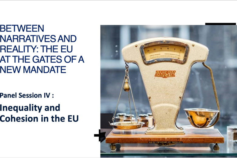
This blog post is part of a series reflecting on the panel discussions held during the conference "Between narratives and reality: The EU at the gates of a new mandate", which took place at the Faculty of Law of Maastricht University on June 20 and 21, 2024. This panel addressed inequality and cohesion.

Panel 4