Colours
UM’s colour gamut is based on four basic colours: dark blue, white, orange-red and light blue. The four basic colours can be extended with target group colours in media intended for specific target groups.
Dark blue
Primary colour
CMYK: 100/60/0/80
RGB: 0/28/61
PMS: 295
Webcolor:#001C3D
Sikkens: T0.30.20
The house style’s primary colour is dark blue, which is used as the logo colour on all UM communication media. A cool, dominant colour, it symbolises an academic organisation that inspires confidence and professionalism.

White
Primary colour
CMYK: 0/0/0/0
RGB: 255/255/255
PMS: ----
Webcolor: #FFFFFF
Sikkens: ----
The white background is pure, forming a clear basis for the dark blue/black logo. The white logo band above the image contrasts strikingly with the logo, setting off the word brand (‘Maastricht University’).

Orange-red
Accent colour
CMYK: 0/80/100/0
RGB: 232/78/16
PMS: 1665
Webcolor: #E84E10
Sikkens: D6.60.50
Orange-red has been chosen as the accent colour, but also to balance the dominant blue. Its warmth symbolises UM’s human and passionate side.

Light blue
Accent colour
CMYK: 90/0/0/5
RGB: 0/162/219
PMS: 2995
Webcolor: #00A2DB
Sikkens: S0.50.50
This second accent colour is bright, fresh and in harmony with the others. It has mainly been added for practical reasons, as it offers designers more typographical possibilities. It also contrasts well with the white, black and dark blue letters.

Orange
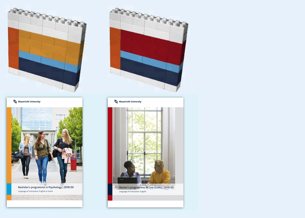
Bachelor’s colour
CMYK: 0/50/90/0
RGB: 243/148/37
PMS: 7411
Webcolor:#F39425
Sikkens: E4.60.60

Red
Master’s colour
CMYK: 0/100/100/30
RGB: 174/11/18
PMS: 1805
Webcolor:#AE0B12
Sikkens: C4.60.3

Proportions
Almost all communication media feature the four basic colours, whose mutual proportions can differ depending on their aim. The main colours, dark blue and white, will dominate in all corporate media.
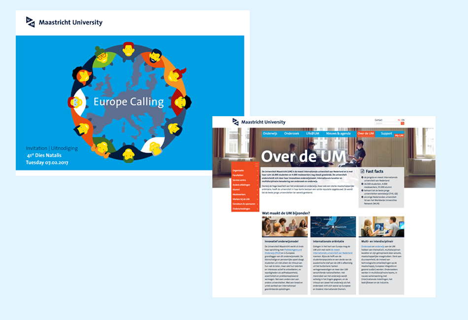
The accent colours, orange-red and light blue, play a supporting and more illustrative role.
- largely white designs are usually more suitable for business media, where excessive use of colour detracts from functionality (e.g., reports, digital newsletters)
- predominantly dark blue designs with accent colours are better suited to more stylish, image-strengthening media (e.g., invitations, annual reports)
The following image shows the target group colours (bachelor's orange and master's red) applied within the context of the four basic colours:
Black and white
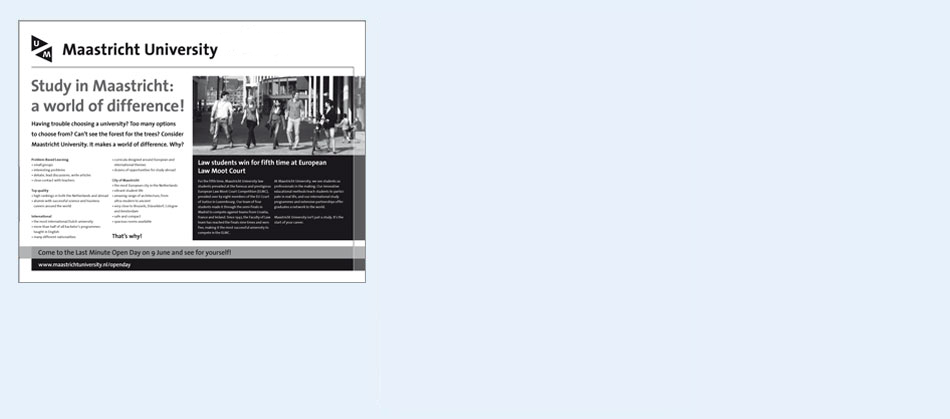
In black and white media, the logo must always be black on a white background. The other colours cannot be translated into black and white versions; in addition, existing full-colour media cannot simply be converted into tone values, as the original colours may generate an entirely different picture. Thus, always design black and white media separately, even if a full-colour version is already available.
Monochrome and duotone
Monochrome (one-colour) media must always be in UM’s main colour, dark blue (PMS 295). These are subject to the same instructions as black and white communications.
Duotone communications must always be in black and dark blue, with the logo in dark blue.
Digital applications
Digital applications use the same four main colours as printed materials.

Light blue alternative
For optimum readability, some circumstances require light blue with a transparent black layer for darker colouring

Colours for specific functions
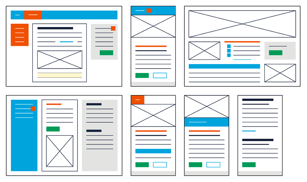
There are several colours available for practical uses such as illuminated blocks, call-to-action buttons, and tips.

----------
Colour proportions
In cases where the logo is absent or the typography plays no role, colours proportions must convey UM’s presence.
----------
Colour and contrast: web guidelines
The public website of Maastricht University must comply with AAA guidelines for web accessibility (Dutch only). This means, among other things, that the contrasts between the use of text and coloured backgrounds (including white) must be sufficient. You can check this with this tool.
There are rules for text larger than 18px and text smaller than 18 px.
These rules are very strict and are difficult to apply within the colour palette of the UM Branding. Though it is very difficult to meet all web guidelines, your content must still be as accessible as possible. The web guidelines for colour are all about contrast. Use colour and contrast to ensure that users understand the navigation, possible actions, and that the content is easily readable. This involves both colours and text, in making them as clear as possible.